
Summary
GLEAC offers a micro-practice platform that helps users build career skills through real-world scenarios. Despite its popularity, low completion rates indicated users were struggling to meet their learning goals. I was brought in to improve engagement and enhance the effectiveness of the learning experience.
My Role
User Research, UI Design, Prototyping
Team
Working directly with the Founder & CEO
Client
Gleac
Duration
3 weeks

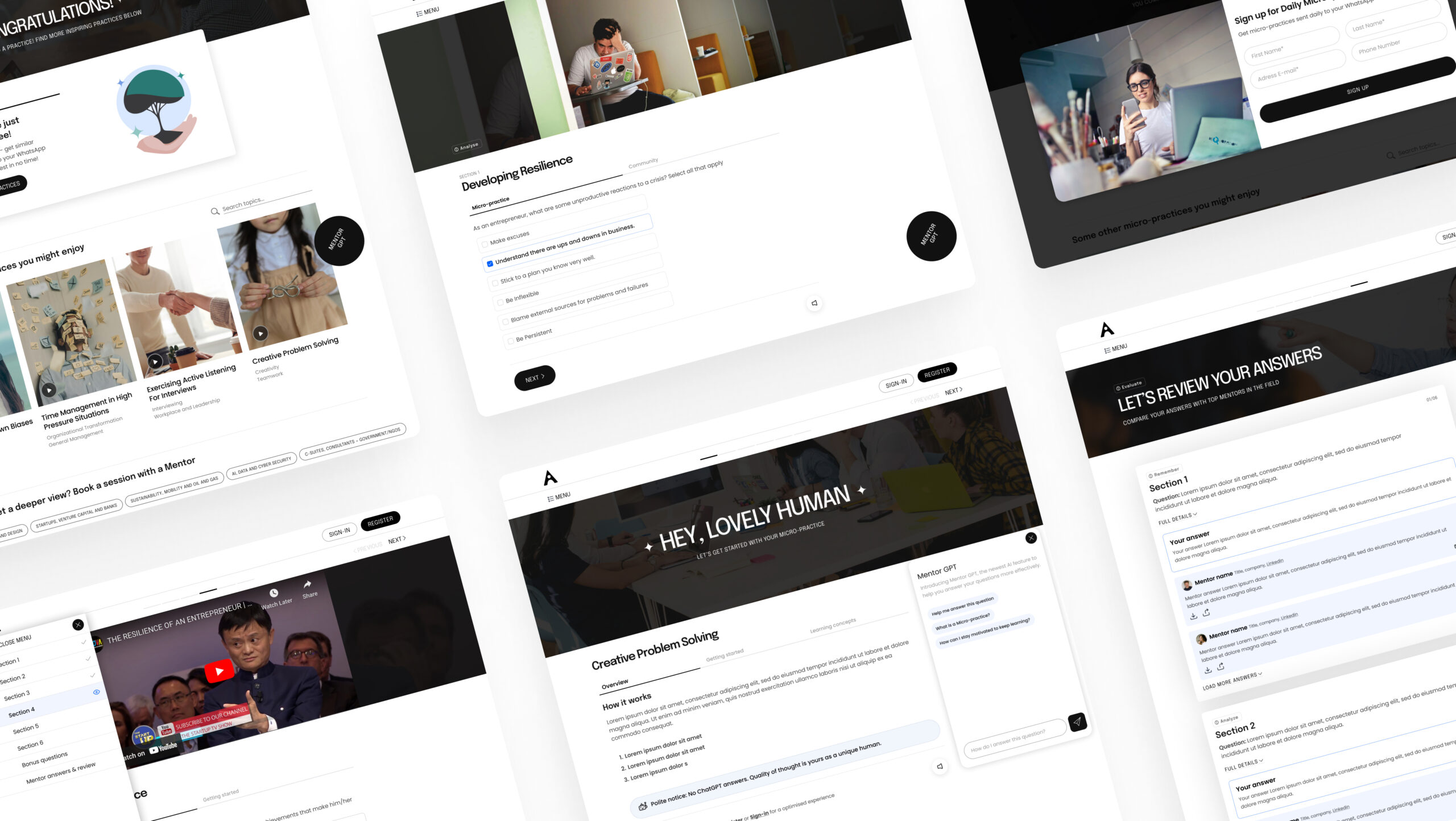
Before / after the re-design.
Main Goals
01. Prioritise ease of use & accessibility
Ensure the experience is is intuitive and problem free for all users and all device types.
02. Support user engagement & learning
Keep users engaged through interactivity, rewards and other motivators.
03. Utilise latest technology
Explore new features, utilise the latest ai technology and industry best practice to future-proof the experience.
Research & Discovery
Given the time restraints on this project, I felt a mix of analytics and user surveys would be most effective route to quickly gain an overview on the user and their current experience. Fortunatley, the learning designer had recently conducted user interviews on this experience which helped provide deeper insights on the users thoughts, feelings and pain points. Being a newbie to the e-learning sector, I also carried out a competitive audit and secondary research to help me better understand the landscape and best practices.

Key insights
01. Community drives loyalty
The learning community, mentor answers, events and connection to the CEO were all big factors of users returning to the experience. One user also commented that the sense of community created a safer and more effective environment for him to learn.
02. Not optimised for smaller screens
Many users were confused by the interface and frustrated bt the amount of scrolling on smaller screens
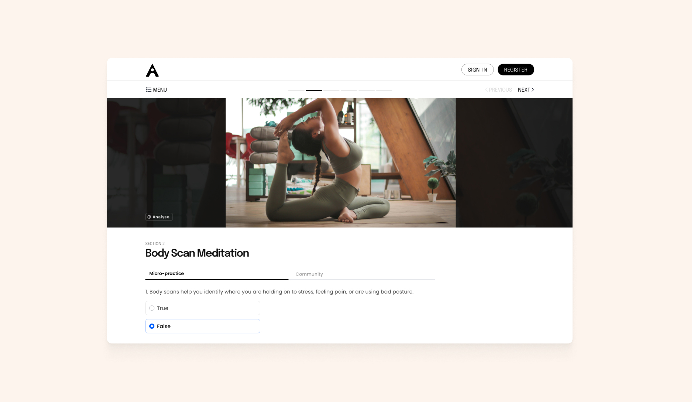
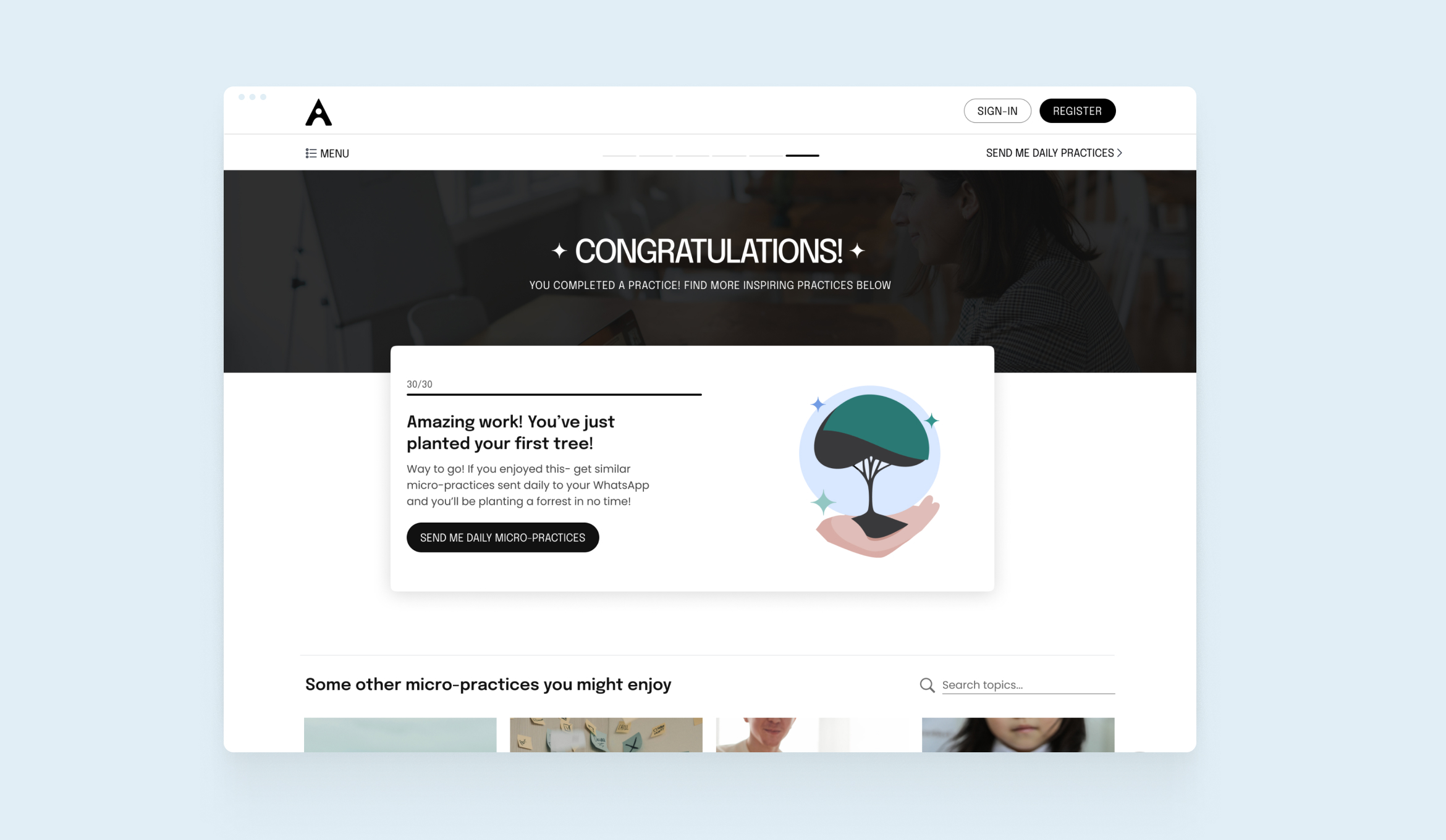
03. Lack of feedback and progress
Although Gleac plant a tree for every 30-day learning streak, there was no clear way for the user to view their progress. Some users felt the experience didn't make it easy or rewarding to keep up their learning.
Refining the right ideas
After brainstorming possible solutions with the team, I met with the developer to discuss the feasibility and scope of the ideas. I then mapped these out on an Impact/Effort matrix to prioritise the solutions that would have the biggest impact on the project. I then did quick wireframes and built several prototypes to test these with stakeholders and Gleac users.

Increasing community & mentor interaction throughout the experience
The users found real value in interacting with mentors and the learning community and expressed a desire to go deeper into some of the lesson topics. To build this engagement throughout the entire lesson experience, we:
- Added in-time help with a new answer hint module, that appeared to encourage learners who have been stuck.
- Designed a Community tab to help learners discuss answers in more depth.
- Added the ability to message a Mentor to get an expert's perspective.
- Improved the mentor answers by increasing scanbility and readability. We also added the ability to share & download Mentor answers.

A sense of progress
To encourage users to keep learning, we added an extra step to the user journey which celebrated their progress and promoted related courses. I designed a progress card with a playful animation to promote Gleac's initiative of planting a tree for every 30-day learning streak. I also de-cluttered the navigation and simplified the progress bar to give a clearer sense of progression during the micro-practice.
Impact
26%
Increase in avg
engagement time
166%
Increase in views per user
8%
Increase in user stickiness
-10%
bounce rate decrease
Reflections & next steps
Allow more time & resources for user feedback
Getting feedback from the survey took longer than expected and ideally we would have had more responses. Allowing more time for user feedaback and providing incentives would've given us a more accurate picture of the user experience and the most common pain points.
Keep feautres minimal for an optimal learning experience
Initially we made help features more prominent (such as a chatbot) to help users who were stuck. During user testing, however, we discovered that learners were getting distracted by these and were less likely to complete the micro-practice. By making the lesson interface less cluttered, whilst keeping help available, our refined interface helped the user focus on the task at hand and increased completion rates.
Next: A more tailored learning experience
During research we discovered a high demand among users for a more tailored learning experience with more job/industry specific content. We had several concepts that employed user data and ai that unfortunately we didn't have the resource to make. These will hopefully be used improve the next iteration of the product!
Have a project in mind?
Let's talk.
Contact
harrygraham86@gmail.com
+44 7845 709367
LinkedIn