
Summary
Quai digital is a white-label digital savings platform, specialising in investment products and financial administration services for the wealth management and fintech sectors. Working for Wellhouse, I was asked to re-design their website to help raise their profile and generate more leads.
My Role
Research, Website Design, Development (Wordpress)
Team
Working directly with Lucy Capon, Marketing Director at Wellhouse
Client
Wellhouse Marketing & Quai Digital
Duration
1 Month
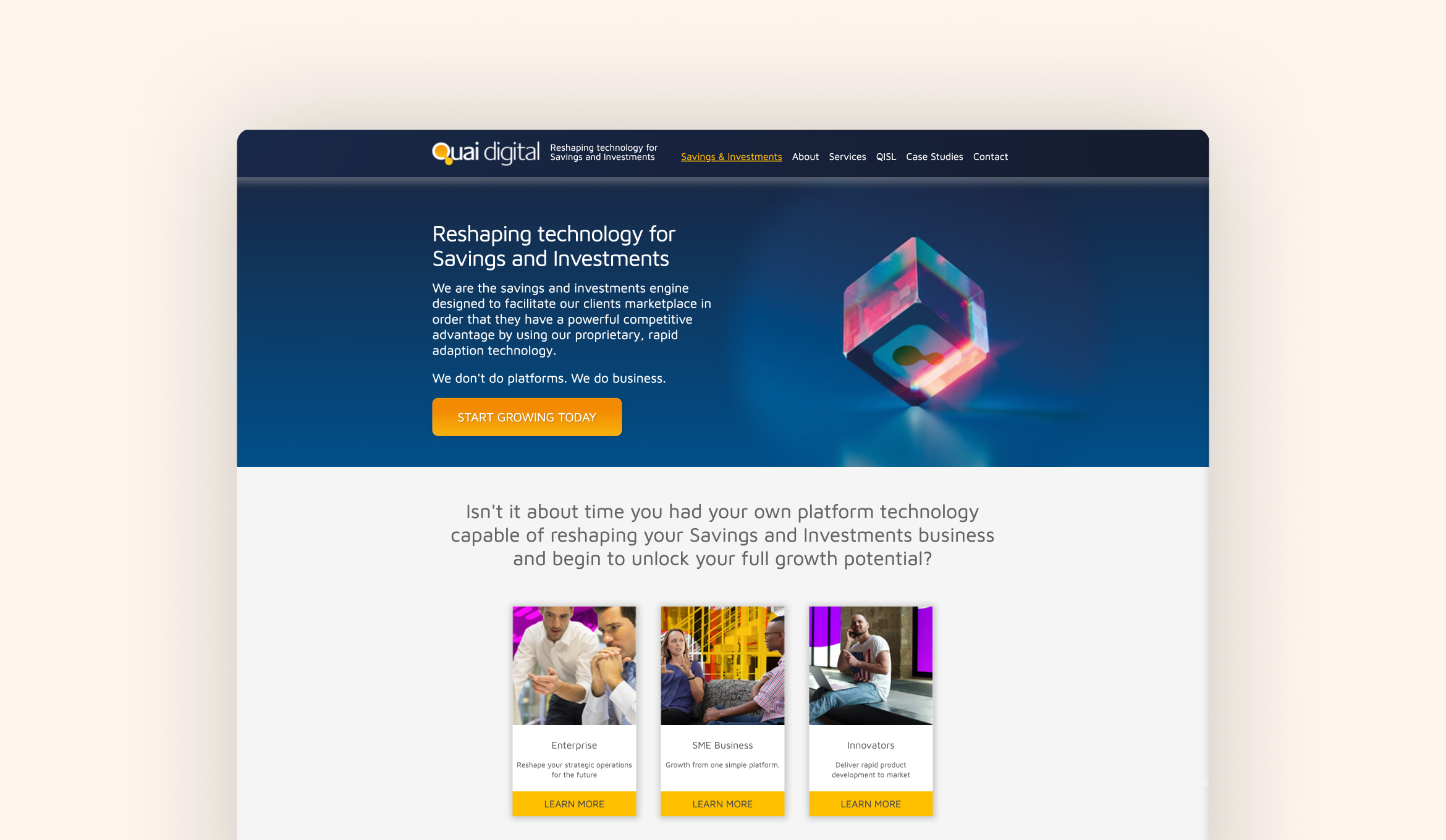
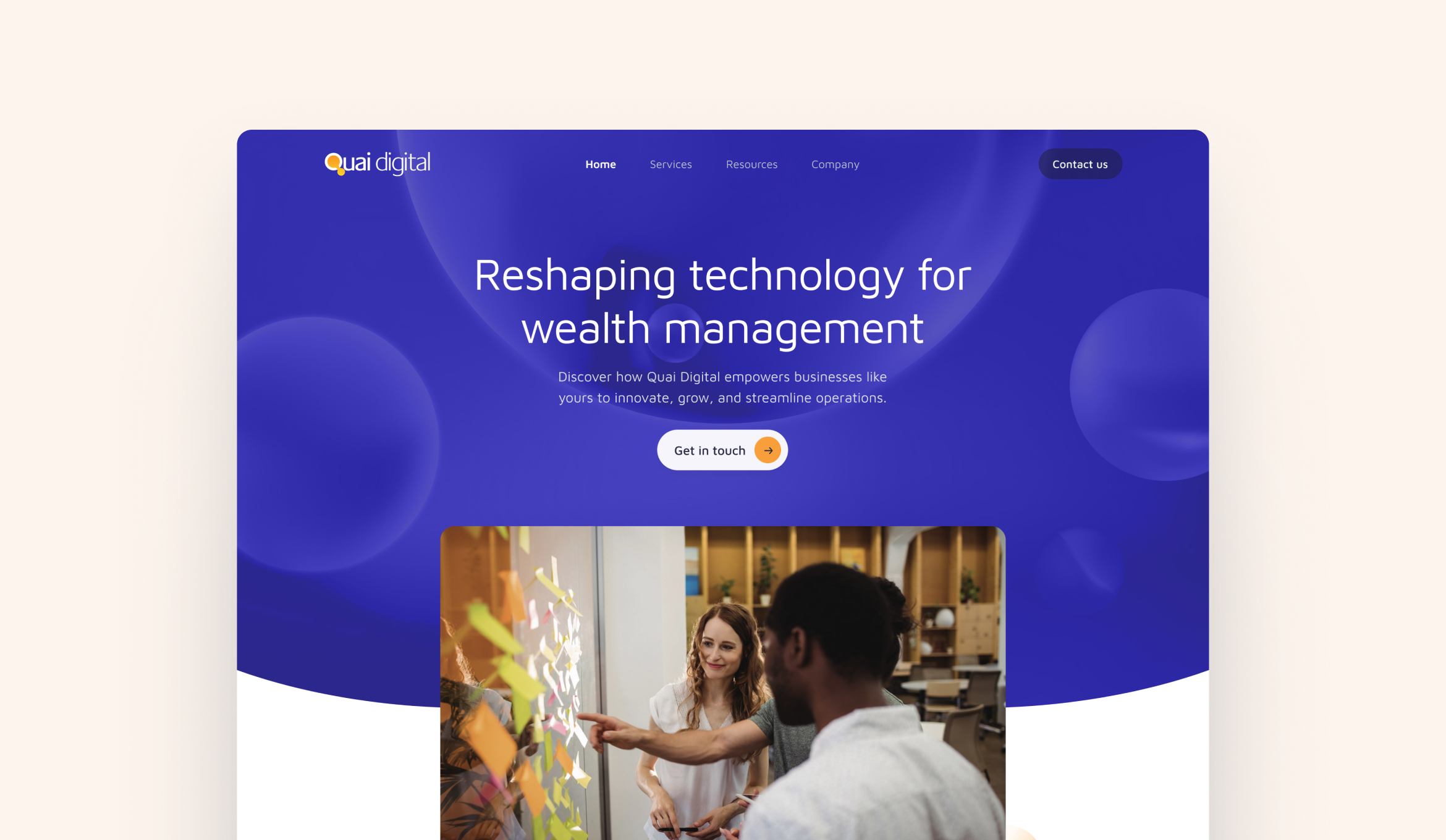
Before / after the re-design.
Main Goals
01. Provide information
Highlight and detail the range of products and services offered by Quai Digital.
02. Demonstrate credentials
Showcase client testimonials, case studies, certifications, and industry awards to build credibility.
03. Generate inbound leads
Implement strategies and tools to convert website visitors into potential leads through contact forms, downloadable content, and calls-to-action.
Research & Discovery
Building on Lucy's market research for the brand, I performed a competitor analyisis and created personas to gain a deeper understanding of their audience. Our key findings from the research were:
01. Competitors appear more tech savvy
Quai's current website was dated and didn't reflect it's technical and innovative capabilities. The wealth management marketplace evolves quickly and a modern website is essential to stay competitive.
02. Competitor differentiation
Quai might not have the biggest name or budget, but they usually win face-to-face pitches. There's a clear opportunity to stand out with a bold, human-focused brand that breaks from the minimal, technical look of the competition.
03. Target audience
The target audiences for Quai are traditional wealth managers & wealth management challengers. The new website needs to balance a feeling innovation and integrity to appeal to both of these audiences.

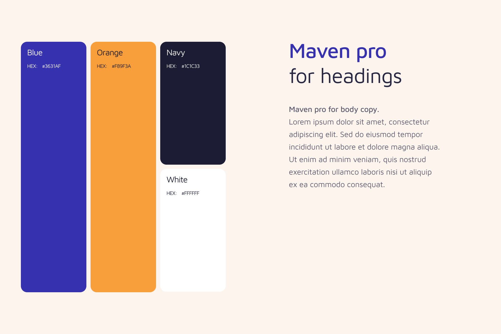
Visual Identity
This wasn’t a full rebrand, but I gave the brand’s main colours and fonts a refresh to make sure they were used consistently and in a way that was accessible and purposeful. The updated typography made the page hierarchy clearer and helped us highlight key messages for potential clients.
Imagery
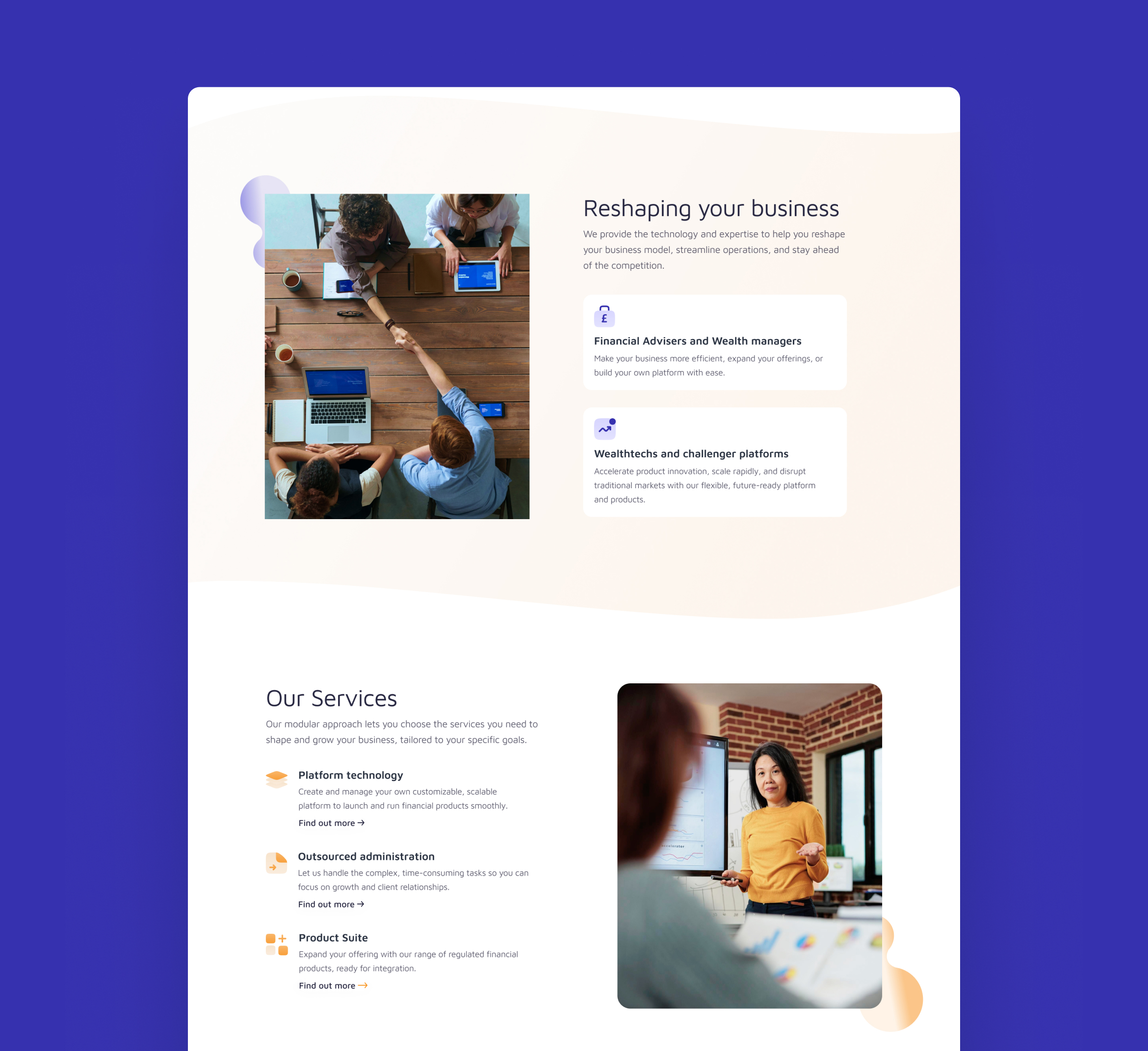
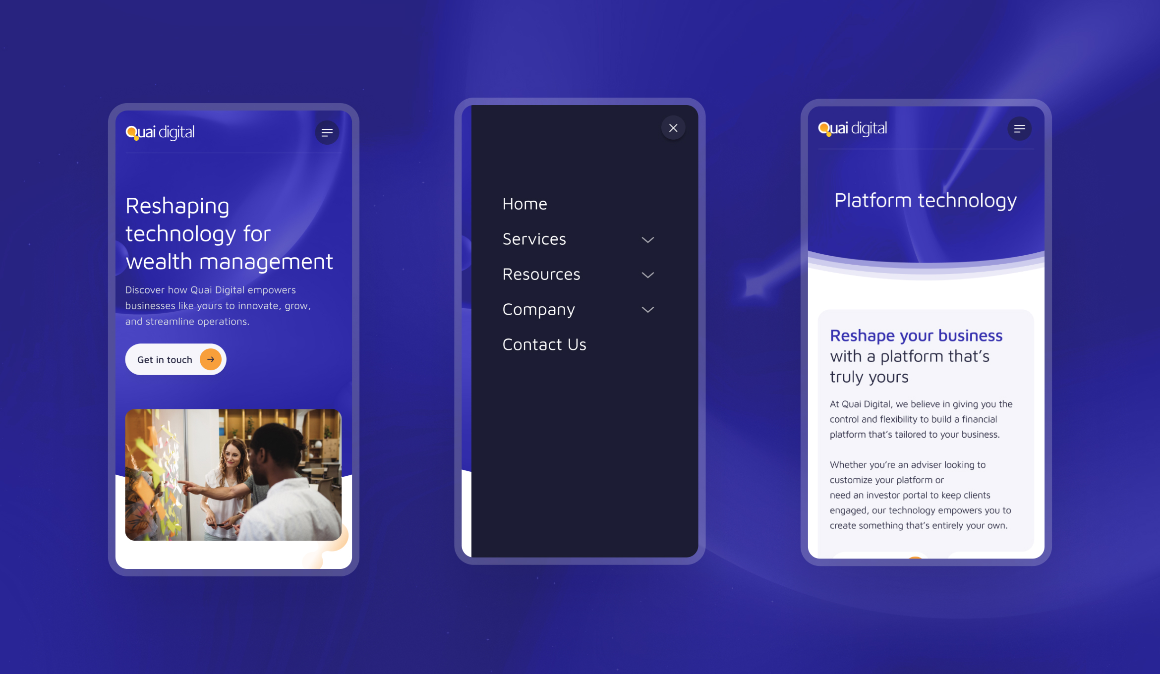
To help set Quai apart from it's competitors, I defined a human-focused photographic style featuring positive, modern workplaces to convey their values of innovation, collaboration and client-centricity.


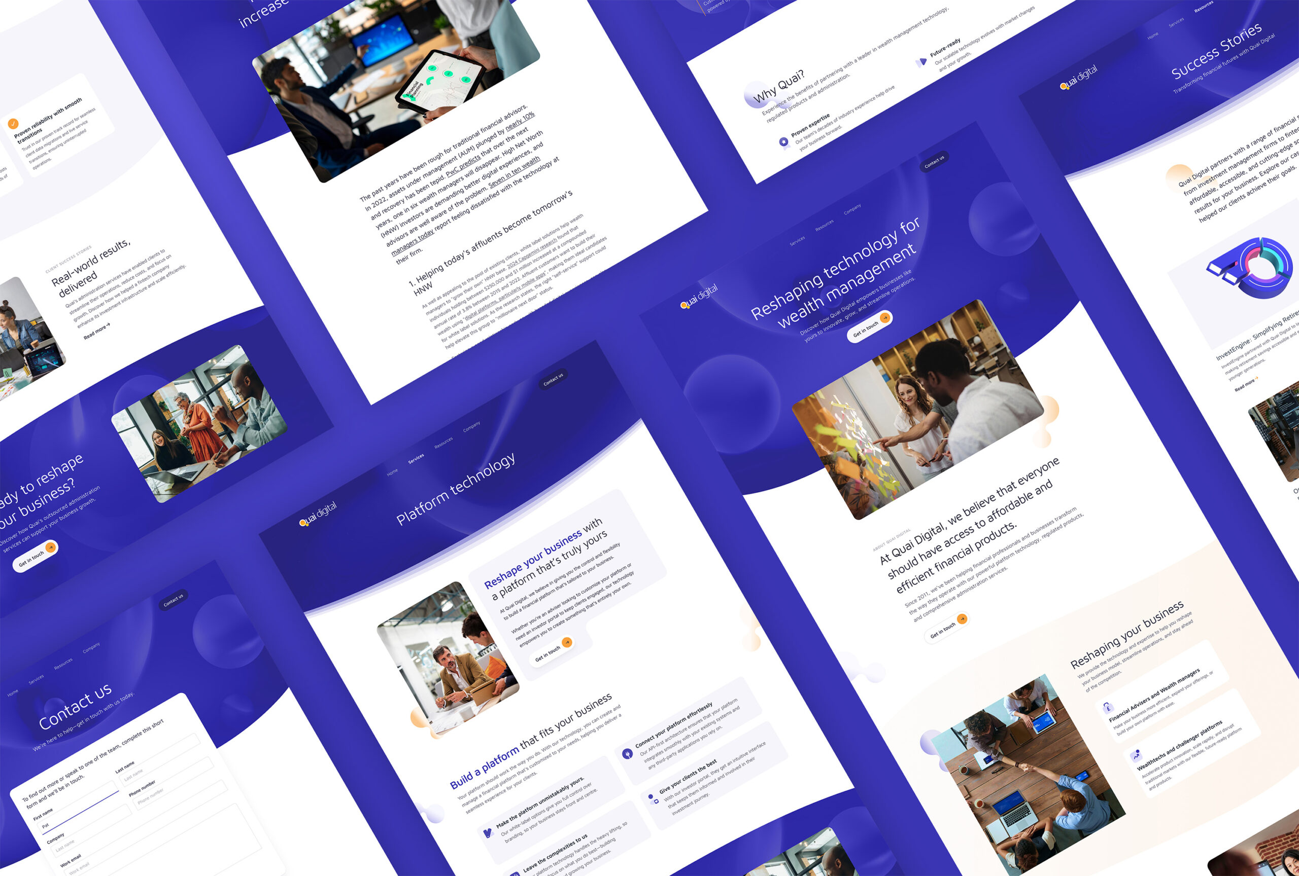
A clear structure that is easy to scan
For the key pages, the layout followed common patterns (such as F-patterns and zig-zag) that helped user's easily scan the page for an overview. By keeping the content minimal on these pages we could guide the user to key cta's and help generate new leads.
Showing innovation through fluidity
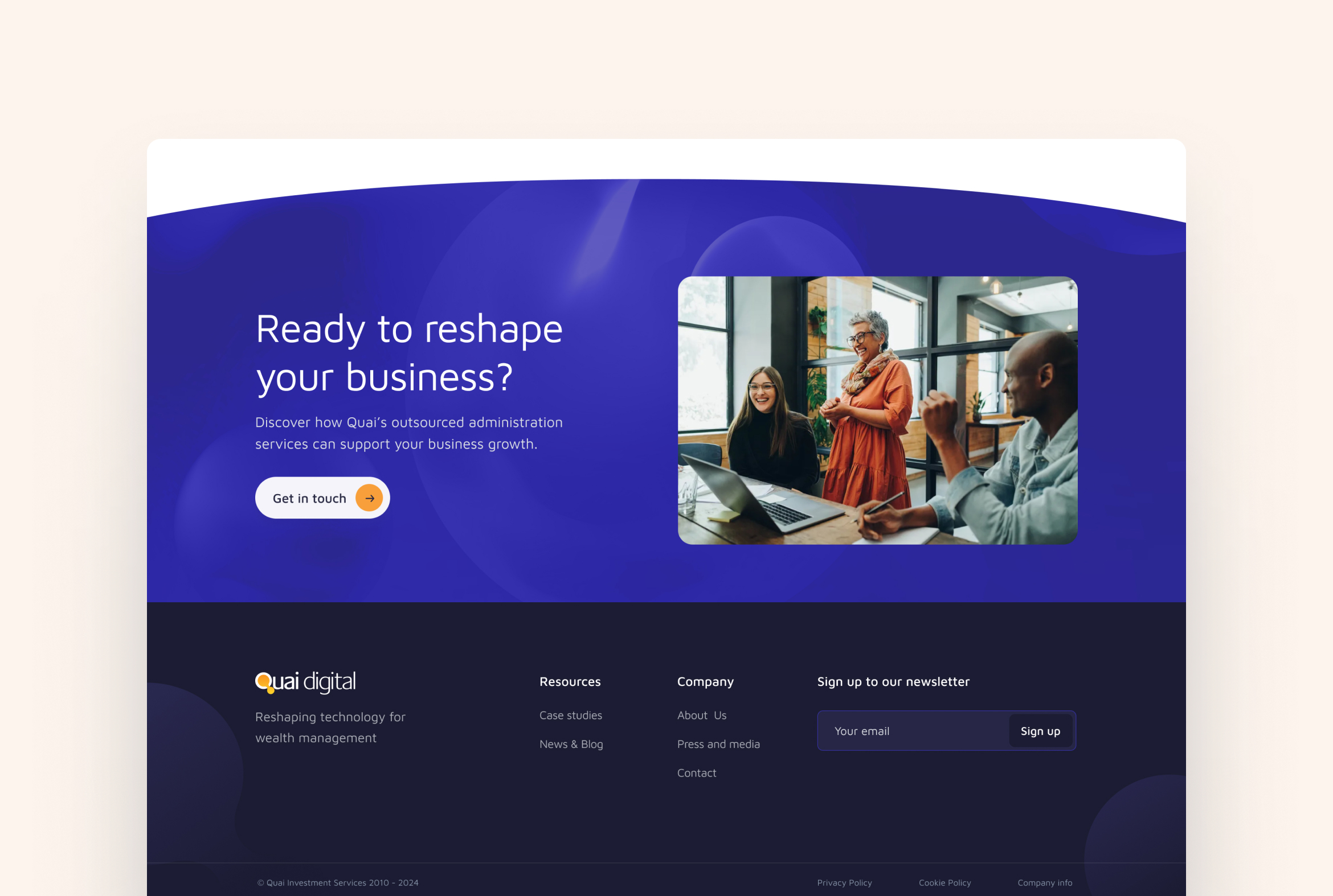
To help Quai connect with Wealth Management Challengers, the website’s visual design leaned into a theme of innovation. Drawing inspiration from the bubbles in their logo—often symbolic of ideas—I created a series of dynamic header images featuring fluid, shifting forms that suggest movement and adaptability. This concept carried through the site with flexible text modules, translucent dividers, soft rounded corners, and subtle motion, all working together to reinforce a sense of forward-thinking.
Bold, clear CTA's
Using the vibrant blue backgrounds only for headers and CTA sections ensured these stood out from the content. To help increase conversion the cta's had concise, well-written copy and bold buttons, the new cta's were easier to digest and more inviting to click.
Impact
Happy Senior Stakeholders
Senior stakeholders were thrilled with the bold new direction of their website, celebrating a clear uplift in leads from day one. They were so proud of the result, they couldn’t wait to showcase it to prospective clients as a benchmark for their brand. Hopefully I should have numbers to share soon!
Positive client feedback
Clients regularly shared enthusiastic feedback during pitches and follow-up emails, praising the clarity and creativity of the website.
Reflections
Low-fi wireframes for the win!
Low fidelity wireframes helped us iterate quickly and refine the layouts and flow in order to meet a client deadline.
Appealing to Two Audiences
Quai needed to modernise a dated website that undersold its innovative edge while competing in a crowded, tech-heavy market. Research revealed contrasting audience needs: traditional wealth managers valued trust and relationships, while challengers prioritised innovation and disruption.
The design bridged both. Human-focused imagery conveyed collaboration and integrity, while bold colours and fluid shapes signalled innovation. The result was a differentiated brand presence that balanced credibility with forward-thinking energy and truly reflected Quai’s strengths.
Thinking ahead
Whilst building the website in Wordpress, I was able to use tools to save common components and create standard templates, so that Quai can easily grow and create new pages in the future.
Have a project in mind?
Let's talk.
Contact
harrygraham86@gmail.com
+44 7845 709367
LinkedIn